Project Overview
Role
UI Designer
Duration
October 2022 - December 2022)
Tools
Figma, Adobe Illustrator
Overview
I was assigned to create a small mobile prototype utilizing a style guide of choice and a user flow. The goal of this project was to illustrate my understanding of color theory and visual design principles like visual hierarchy, space, contrast, unity, etc. I completed this task by creating my first e-commerce mobile prototype based on a real candle business.
Style Guide
The style guide was based on the color schemes used from the real Sweet Puffs candle site. I kept a pink color scheme that was used throughout the site the same for my client but introduced them to brown, gold, and neutral tones for better unity and balance. For the font, I went with Oriya MN and BiauKai as the serif look matched well the logo. Since the previous logo had a celestial theme to it, I decided to add celestial designs in my app with the tool Adobe Illustrator. Designing the elements brought more pop to the pages and especially in the advertisement sections.
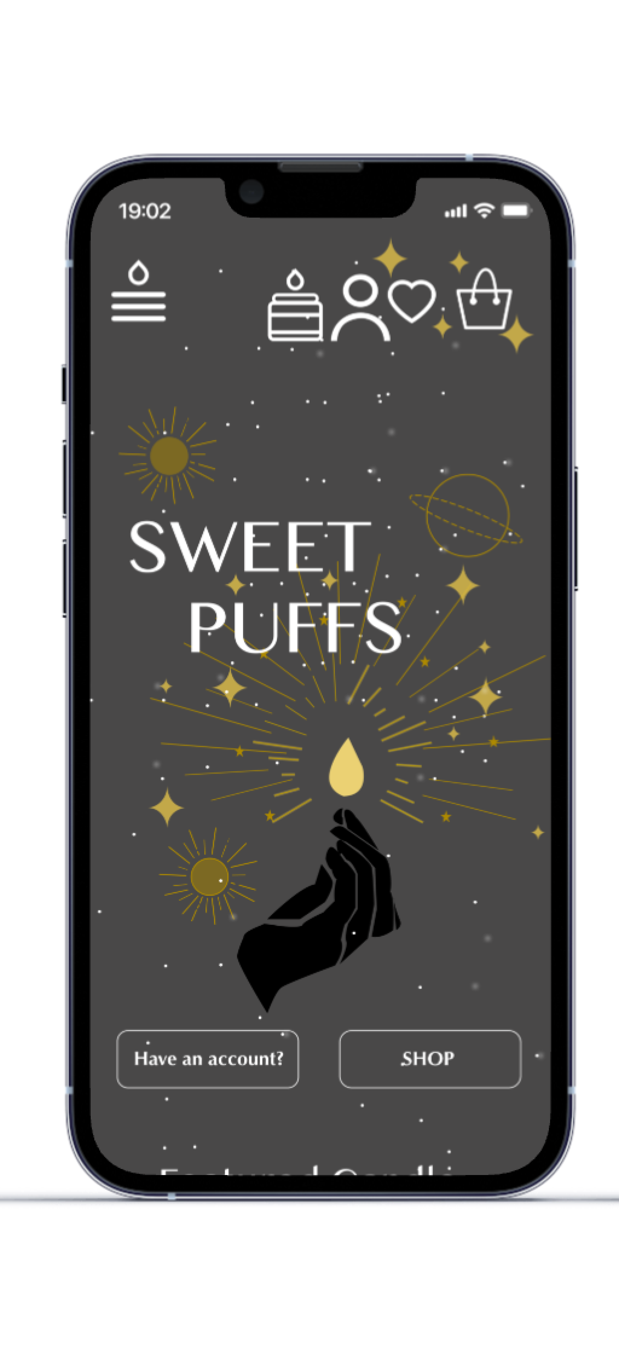
The next focus was to change the logo as the original logo was someone else's artwork. I was contemplating and talking with my client on how we could change it up, and I came up with the hand holding a flame. I felt this design was similar to the previous logo but also different in that it represents not only the candle business but also the candles are crafted by hand. I was pleased with my design and the client was happy too.
User Flow
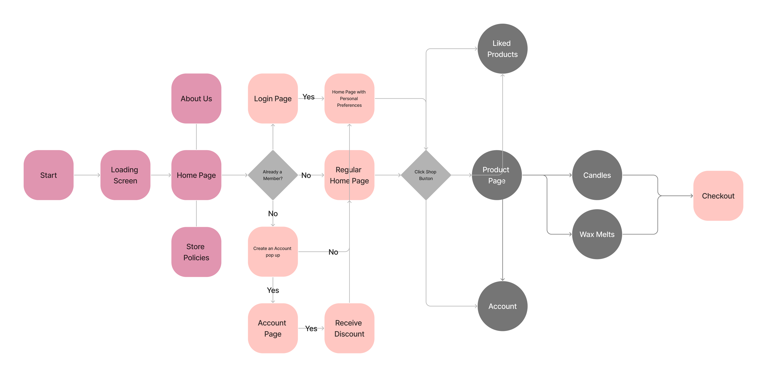
Before designing the wireframe and screens for Sweetpuffs, I created a user flow to represent the paths a user might take when using the app. The user flow starts with several options, including the home page, about us, and store policies. There’s another pathway if a user clicks on the pop-up ad asking members to sign up. Eventually, all paths lead to checkout. The pathways are similar to a user interacting with the Sweet Puffs website.
Mobile Screens
While designing the home screen, I wanted to feature the logo as it helps previous users know that the company has a new logo. On the home screen, there is also a pop-up ad to get users to sign up, and I chose a pink background so it won’t overblend with the home background. One extra feature that I added to my home screen was the inverse dark mode effect. There is a design trend in apps having a dark mode, and I wanted to show my understanding of this feature.
For the product pages, I designed them in a typical e-commerce layout as users are used to seeing less than two products on a screen. I mirrored the layout based on a lot of fashion e-commerce apps.
When I designed the specific product page that features the product, I wanted a simple layout that was straight to the point. One key feature of the specific product screen is the ingredient icons. I found it important that users receive a visual version of what is in the candle.
One of the last important pieces of my mobile prototype was the icons. I wanted to play around and see what icons I could develop for users to understand easily. I came up with the candle hamburger menu and a candle icon to represent the products. I liked how the icons turned out, but I wish I aligned them better and possibly made them smaller.
Key Takeaway
This was my very first prototype for a visual design class. I learned a lot about the importance of knowing color theory and visual design principles. I am proud of what I was able to accomplish like building and animating the pop-up ad. Also, I was proud of creating multiple designs and a logo with Adobe Illustrator. Some of improvements I want to make next time is making sure my frames and layout is aligned as my product pages looked a bit different from my home page.
