Project Overview
Role
User Interface Designer
Team
Individual
Duration
March-April 2023
Tools
Figma, Adobe Illustrator
Overview
I was tasked to create a context scenario and design an app that demonstrates design theories learned in visual design. I created a mobile interface through the process of wireframing and utilizing a style guide.
Project Goals
Create a context scenario to understand how the user’s needs will be met.
Design a style guide as a blueprint for the mobile interface layout.
Create 5 or more screens inspired by the context scenario and use the style guide.
Context Scenario
Before developing a context scenario, I needed an idea of what the app would consist of. I was tasked to create an app of choice and I decided to make a soccer/football streaming service app. I looked through soccer-related content on Twitter and Instagram accounts plus streaming services to get an idea of who the user might be and get a general understanding of the soccer domain. In my research, I found soccer/football fans tend to pay for multiple streaming services to watch different leagues.
To solve this issue, I came up with the app “Gol F.C.” a streaming platform that lets soccer fans track matches, leagues, and teams at any time. With this app, I was able to create a context scenario for a soccer fan who wants to watch multiple matches and keep up with their favorite teams.
Style Guide
The style guide was created from the colors of a typical soccer pitch. I used Coolors color contrast checker to decide if the gray tones had better contrast with the green color scheme.
For Typography, I chose Inter sans-serif font as it goes well with the minimalist theme of the app. This creates unity within the app and helps users read and understand the content better.
I chose icons to match some of the features of the app like the TV icon represents where a user can watch matches and the soccer ball icon represents where a user can track players and teams.
The logo was mirrored from a real goalpost as it’s one of the key features of soccer/football. The user will be able to comprehend and navigate to the app by the simple design.
Screens
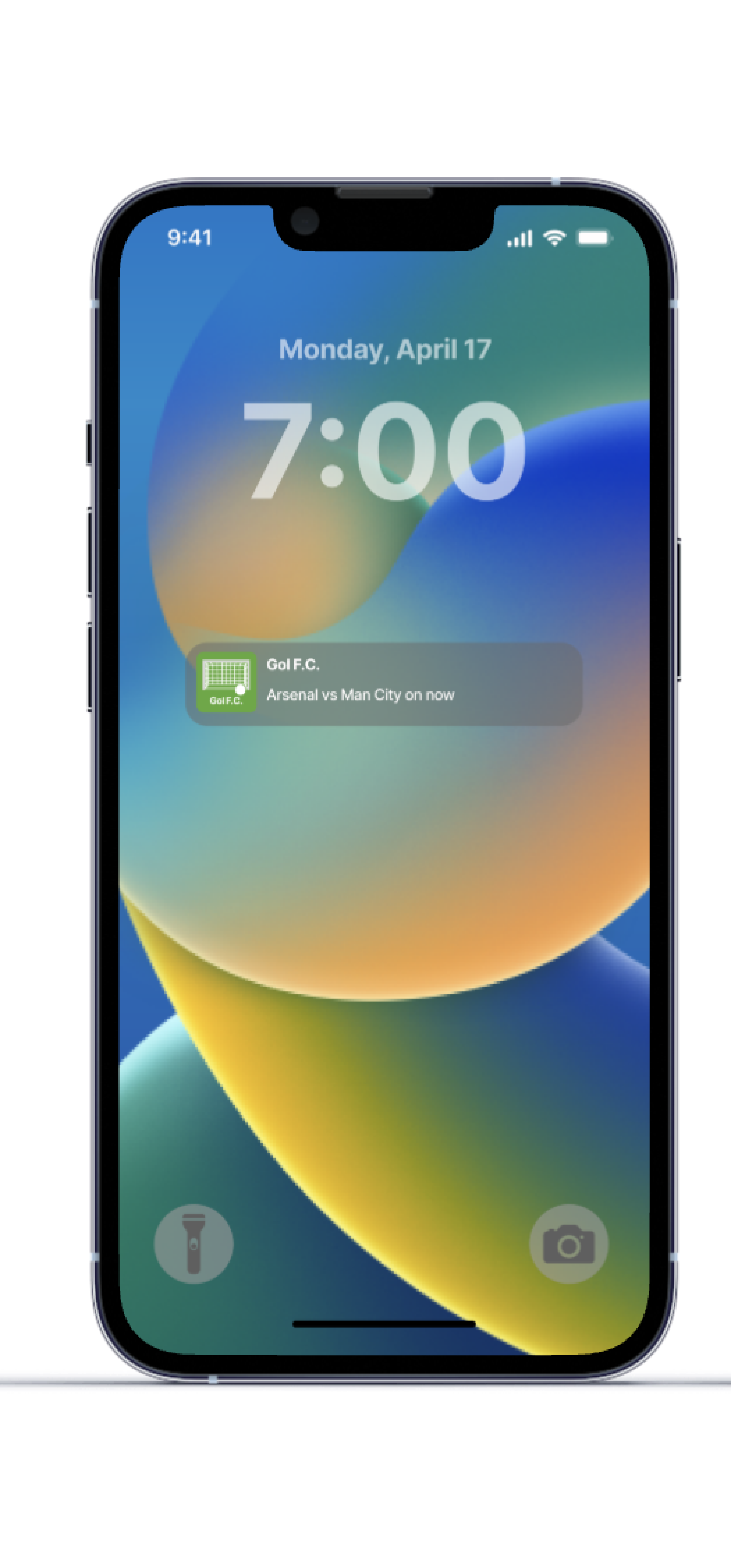
Notification Screen
This screen is a prototype of what the app reminders would look like if a user set notifications. I chose to design this page like a typical notification screen as users are used to seeing the app displayed next to the text.
Home Screen
The Home screen is designed to feature content that can be accessed immediately without overwhelming the user. A user can scroll up to land on different league pages or access live matches, clubs, or soccer standings on the home screen.
Live Match Stream
The live matches will feature a pull-up bar live chat for users to connect and chat with others. The users’ needs are also met by allowing users to view the starting Xi (11) team formation, score, and stats while watching the live stream. The design is simple as the main focus of this page is for users to watch the game and keep up with the score.
Profile Page
The profile page is where users can connect with other people and keep track of their favorite clubs, players, and leagues. On this page, users can go back to watching matches that they may have started but haven’t finished. The design is simple, convenient, and navigational.
Key Takeaway
This project taught me the emphasis on finding out how a user might use a product. Developing context scenarios helped me stay on track and focus on designing for a user and not myself.
I will remember to always think of the user and create guidelines to develop good interfaces or products.
